
THE INVISIBLE DETAILS THAT MAKE A BOOK FEEL PROFESSIONAL
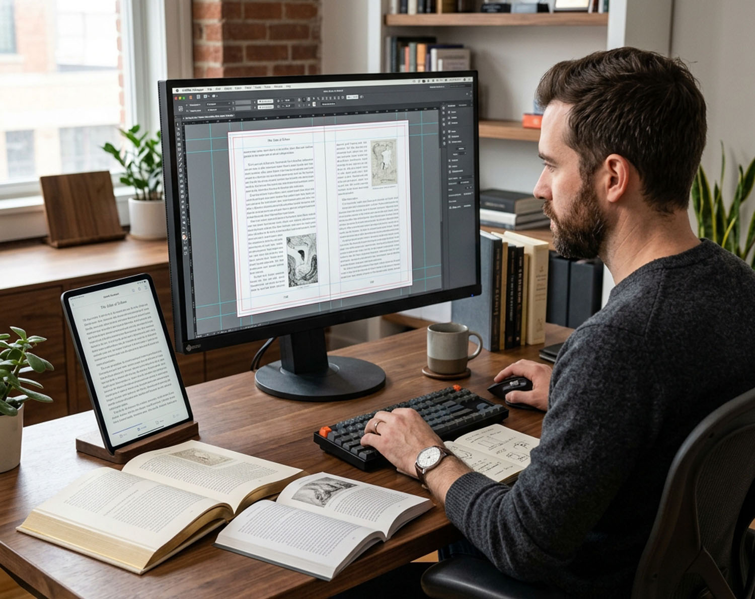
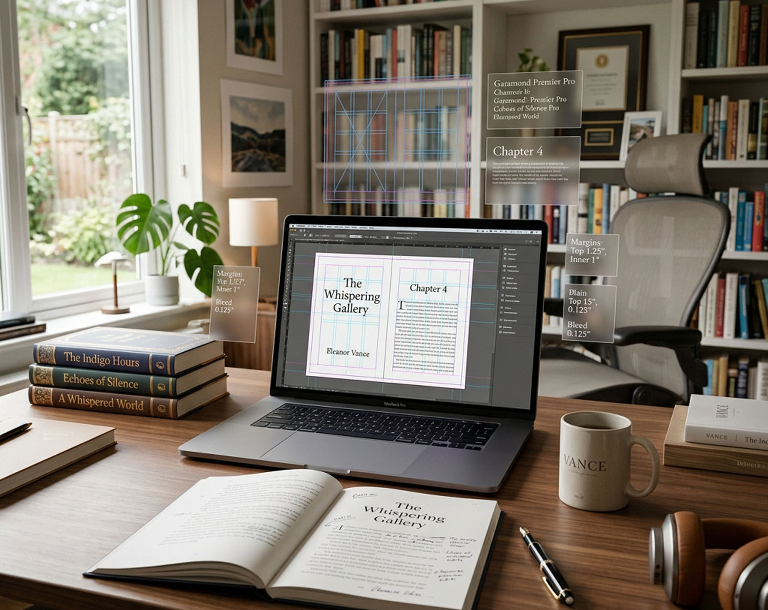
Readers cannot articulate why one book "feels" self-published and another feels traditionally published, but they notice instantly. It is almost never the writing — it is a collection of small typographic decisions that either work in harmony or clash. Line spacing that is too tight makes pages feel dense and exhausting. Margins that are too narrow crowd the text against the binding, making the inner words hard to read once the book is held open. Chapter openings that just repeat "Chapter 1" in the same font as the body text feel amateur compared to a designed drop cap or styled chapter heading.
Then there are the technical rules almost no self-formatting author knows about: widow and orphan control (a single word stranded alone at the top or bottom of a page — a small thing that experienced readers notice subconsciously), consistent running headers that display your book title and chapter name, proper page numbering that starts correctly relative to front matter, and paragraph indentation that follows publishing convention rather than default word processor settings. None of these decisions are hard once you know the rules — but almost nobody teaches them, and the default export from Word or Google Docs breaks most of them by default.