
WHY A "PRETTY" COVER CAN STILL FAIL TO SELL
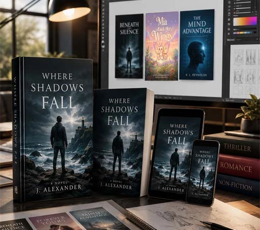
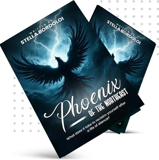
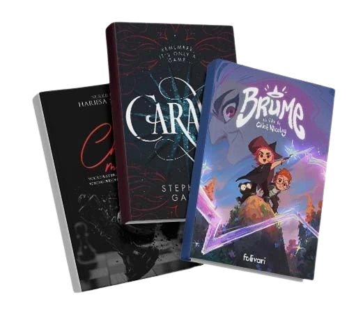
This surprises most authors: a genuinely beautiful cover can still hurt sales if it does not match reader expectations for the genre. A literary, artistic cover on a fast-paced thriller confuses readers browsing that category — their brain expects a certain visual language (bold type, high contrast, a sense of danger) and when the cover does not deliver that signal, they scroll past even if the artwork itself is stunning. This is called "genre coding," and it is the single most misunderstood part of cover design among independent authors.
Every genre has visual conventions readers subconsciously recognise: romance uses warm colour palettes and often features couples or intimate framing; thrillers favour dark backgrounds, sharp typography, and stark single-image focal points; fantasy leans into detailed illustration and epic scale; business non-fiction uses clean geometric design and confident, minimal typography. Breaking these conventions on purpose can work for an established author making an artistic statement — but for a debut author trying to be discovered, working with genre expectations (not against them) is what gets your book picked up by strangers who have never heard your name.